
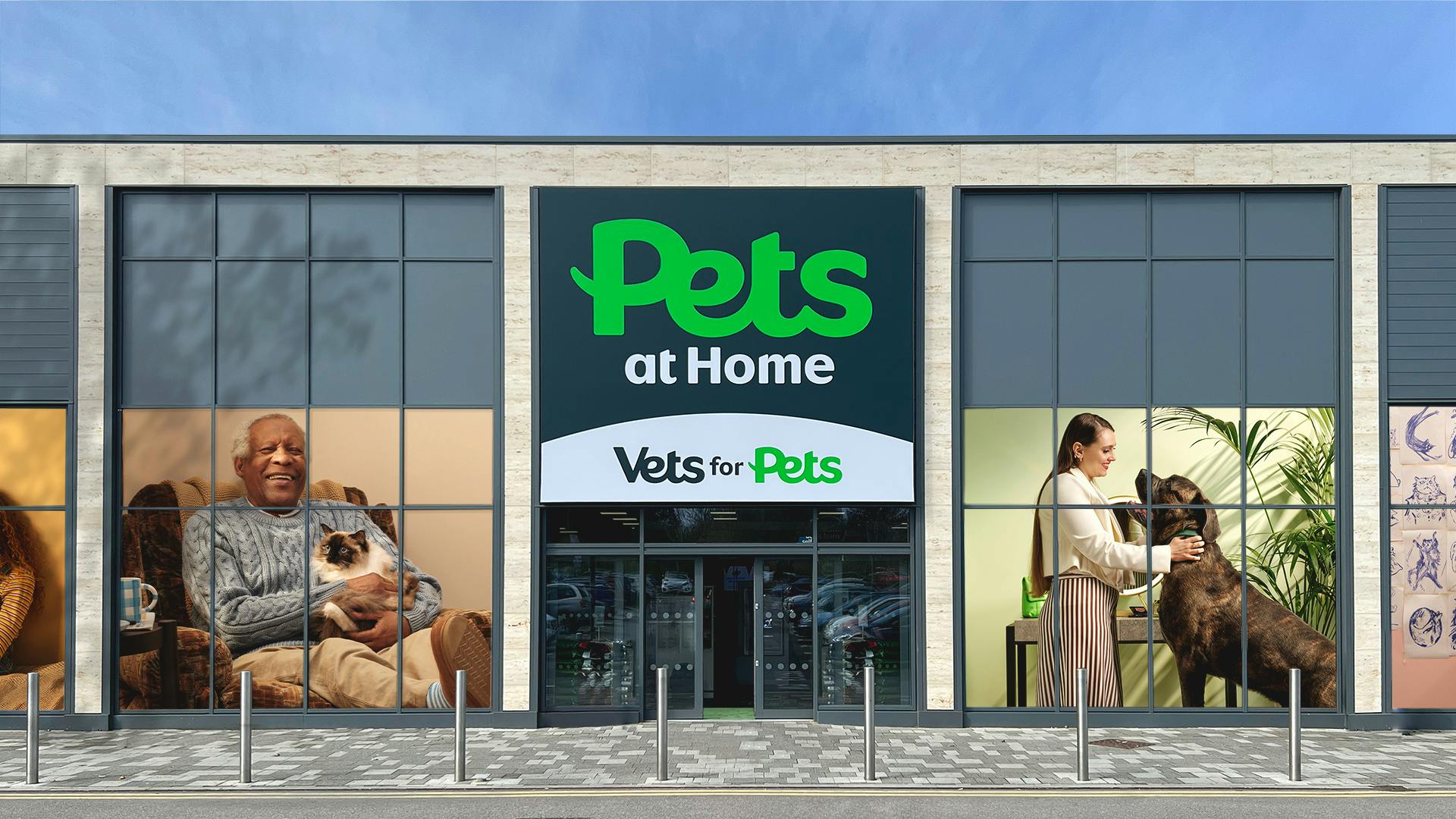
Reasserting top dog status
With over 450 stores across the UK, Pets at Home are without a doubt the nation’s biggest petcare brand. Over the years they’ve helped pet owners be their best by adding a host of services including veterinary care, grooming, insurance, and a foundation that helps pets in need. They are the undisputed top dog of what they do.
Although their world of petcare brands have grown in reputation over the years, they have also grown apart in recognition. The varied identities, naming and brand experience created confusion, and a lack of recognition back to the master brand.


A world beyond the ‘Home’
Previously Pets at Home was made from a group of sub brands, sister companies and services. Although part of the same family with the same strong values, the varied identities, naming and brand experience created no recognition back to the primary Pets at Home brand.
The new structure unites everything through ‘Pets’, a brand name whose simplicity is its superpower and doubles down on its purpose of always doing what is best for pets and pet owners. The new Pets logo serves as an anchor point for the world of sub brands to power up from, creating a team of brands that are stronger together.


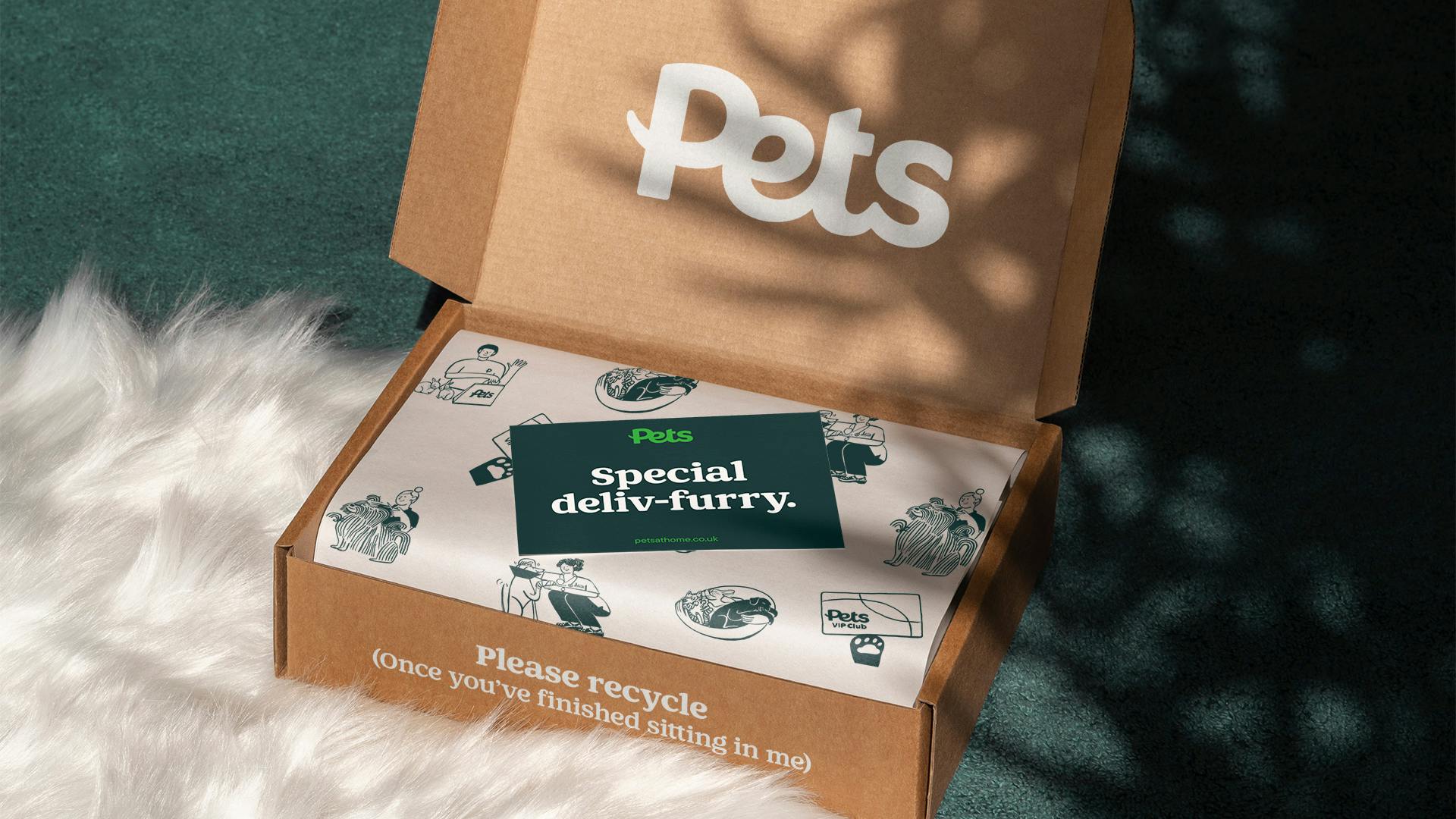
Endless ways to make you smile
Continuing the bold and playful forms of the logo, the graphic system allows for flexibility across the size and scope of the ‘Pets’ brand world.


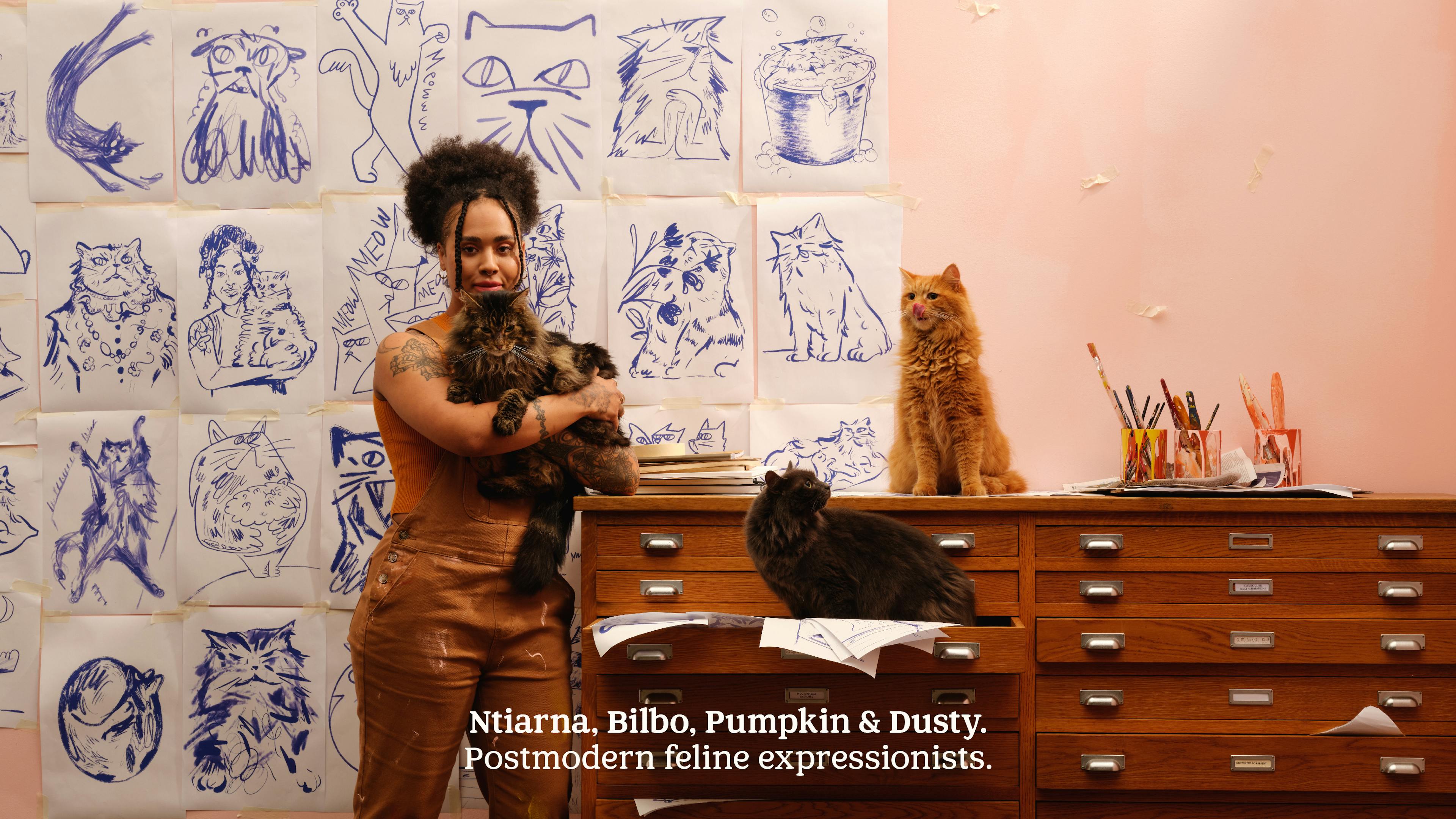
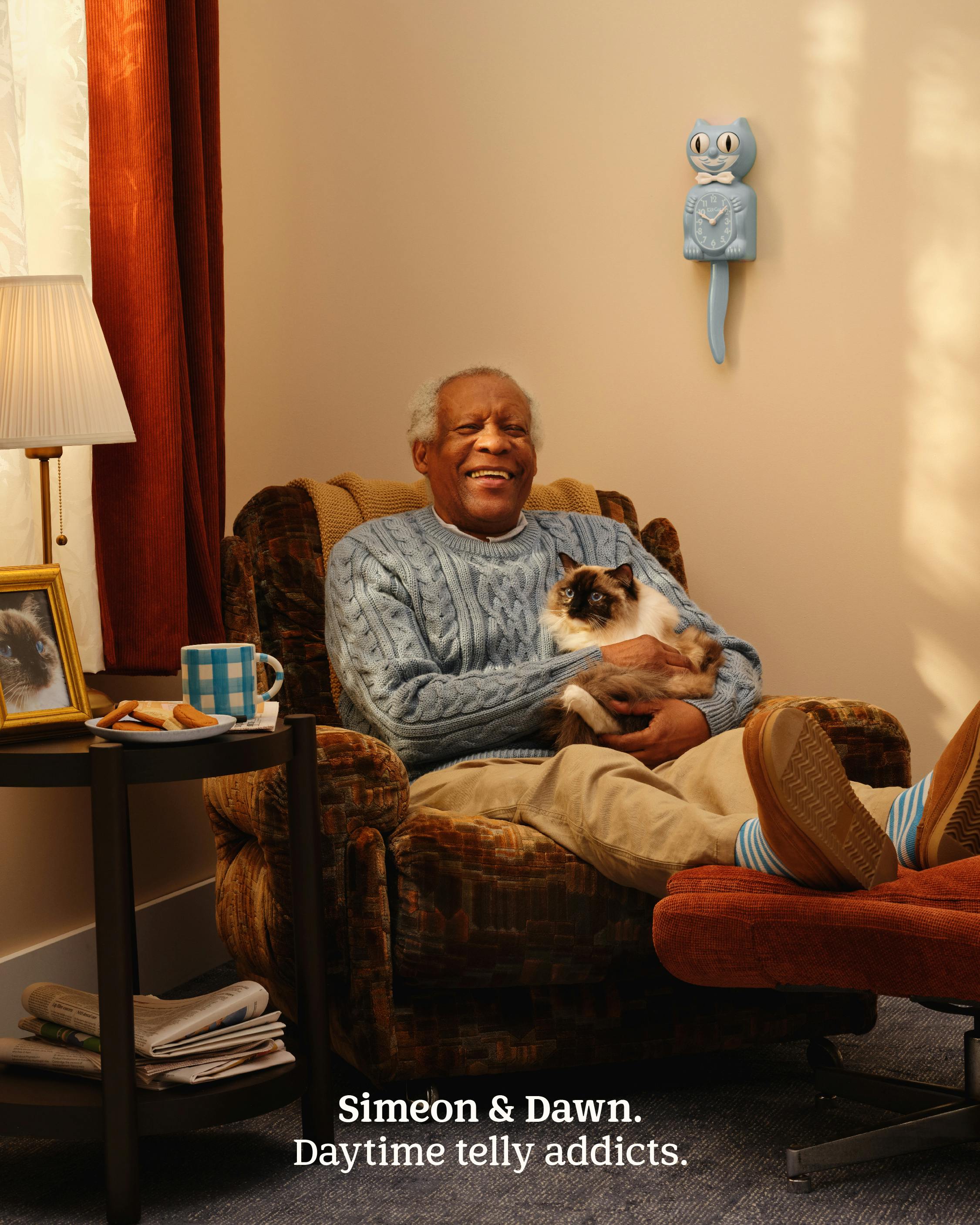
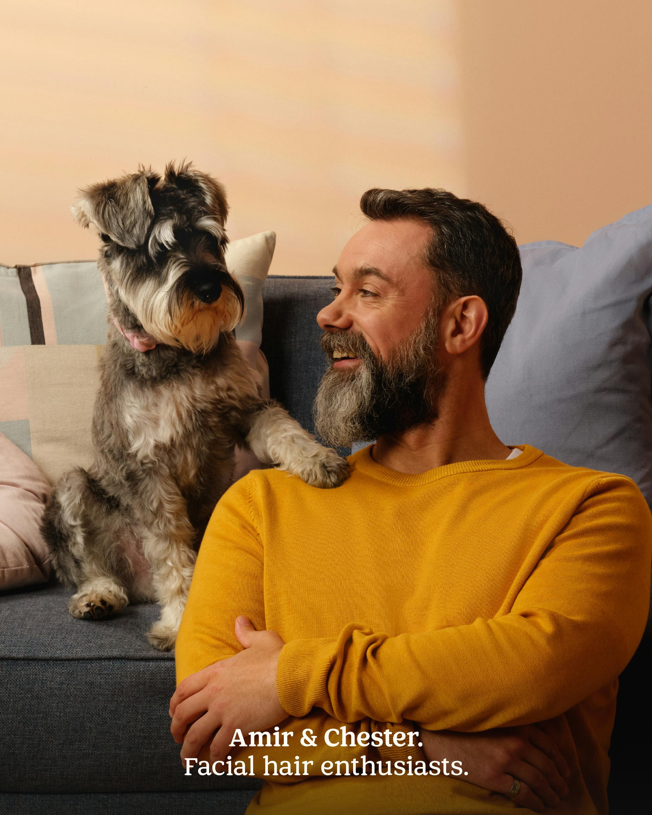
A platform for real people and their pets
Pet owners applied in their thousands to take part in our photoshoot for the new brand. Captured by Roo Lewis, the new Pets art direction principles are a celebration of the idiosyncratic connection between people and their animals. Where some owners start to take on the appearance of their pet, others find companionship in the most unlikely breeds, with pet-owner pairings that simply put a smile on your face.

Pets Club
The place to be if you have a pet – Pets Club helps owners power up their petcare journey with exclusive offers, expert advice and help for animals in need with every single shop.


"Helpetica"
Working closely alongside Colophon, we commissioned ‘Pets Headline’, a typeface to be used across every channel in the brand world. By focusing on a careful balance between being expressive and feeling trusted, the typeface is fit for everything Pets; from weekly promotions through to clinical care advice.


Bringing joy to the customer journey
Working alongside Hannah Warren, we commissioned a suite of illustrations to transform the brand experience of Pets. These add humour and warmth to unexpected areas along the customer journey, by putting owners and animals in offbeat scenarios.


Rolling out the green
With plans to update branding on 450 petcare centres across the UK, Pets needed a campaign to keep their customers informed while their local store, vets or groomers had a makeover.


Keeping sub-branding on a short leash
To give sub brands room to shine while still channeling back to the new logo, we commissioned Colophon to develop a typeface strictly for sub brand wordmarks. The letterforms are inspired by the new ‘Pets’ logo, with tail-flick descenders and sloped-top ascenders to create a sub branding system in harmony with the primary logo.


Championing pet personality
Working with photographer Liz Seabrook we created a suite of pet portraits to be used across brand communications, designed to capture the distinctive personality of each animal and celebrate their individual quirks.


Letting a brand voice run wild
Having pets makes us happy, period. To reflect the sheer joy having a pet means, we developed a bold, irreverent new voice for the brand that oozes eccentricity and reassurance in equal measure.


“Our vision was clear and Nomad have been the perfect partners to help us realise and drive our ambition. They have created a truly brilliant visual identity system which modernises our brand. Whilst creating pure moments of joy that will connect with our consumers.
Their strength lies in insightful creative strategy executed brilliantly. Beyond this they are truly great people, super passionate and tenacious to push boundaries.
A total pleasure to work with. Thank you, Nomad Studio.”
Cath Ryan, Head of Brand, Pets at Home
Check out...

