Creating an American icon
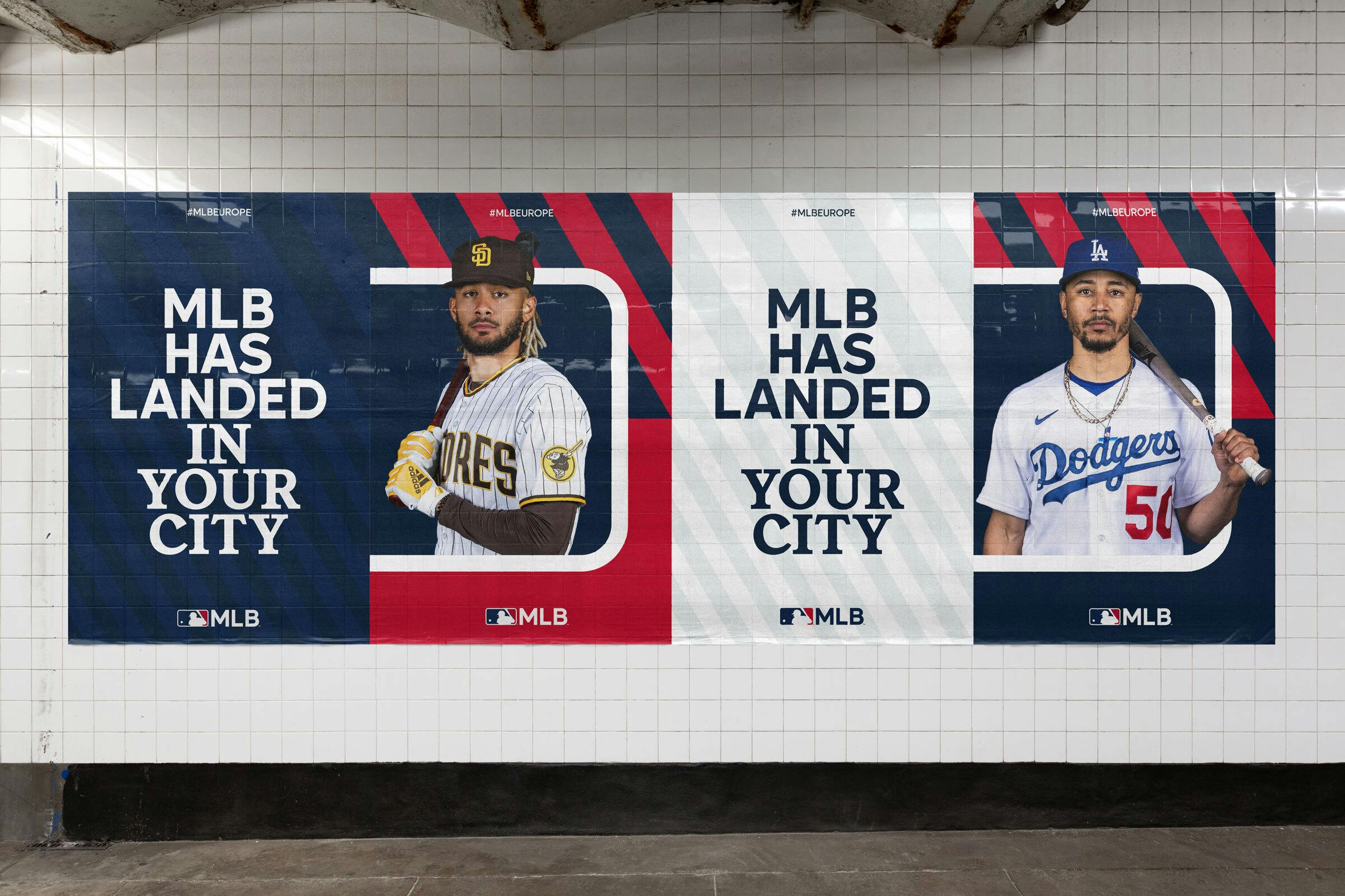
The MLB ‘Batterman’ is one of the world’s most iconic and recognised logos. But since its introduction in 1968, the world has changed unrecognisably. Working in collaboration with MLB global teams, our job was to reimagine the brand for today’s world. The result is a radical refresh, born from the logo, built to flex and stretch across every channel, every audience, everywhere.
Home Run
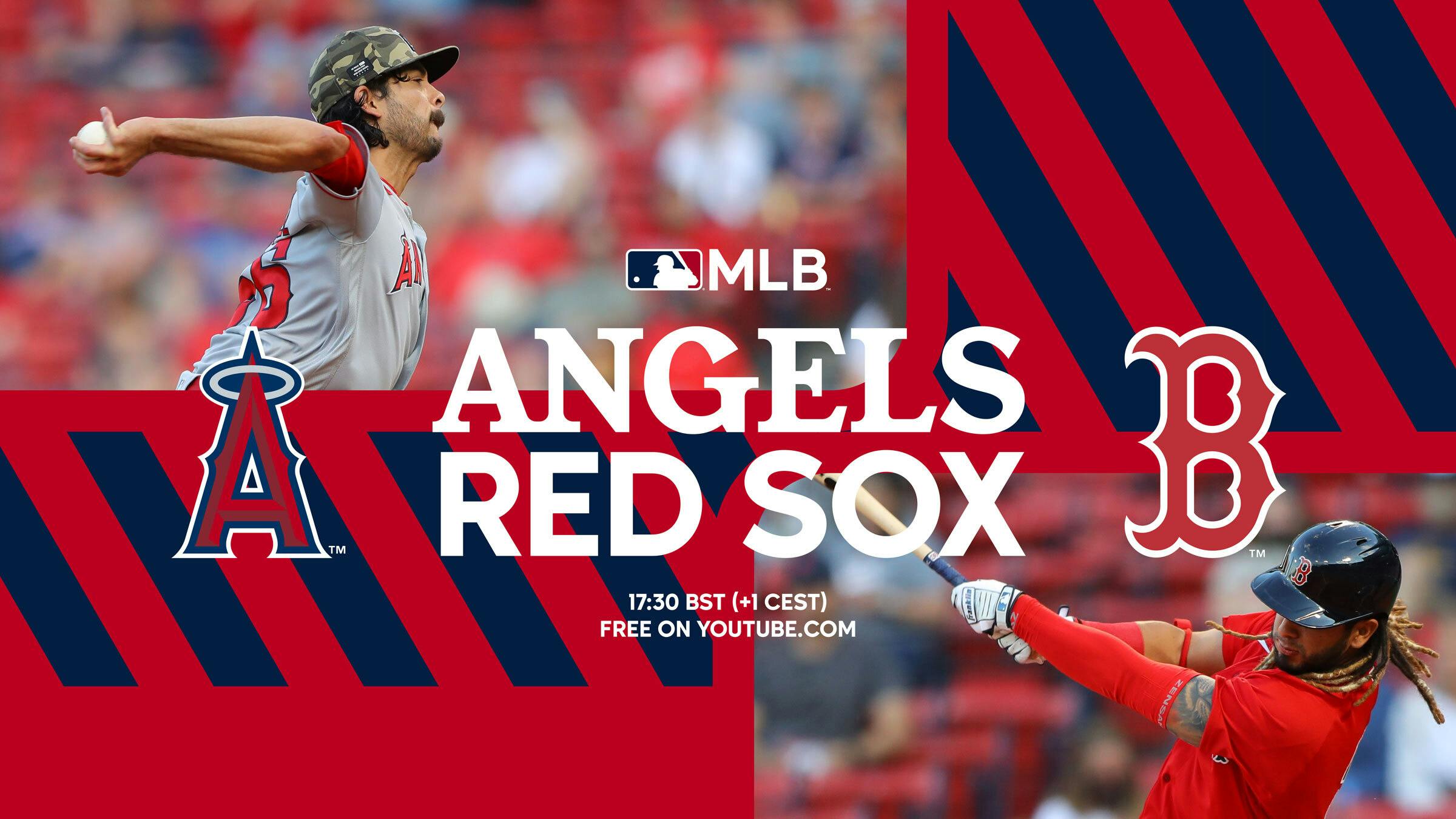
MLB has become a global hit, growing rapidly across the world, attracting new audiences in new ways, from international games, right through to fashion, food and festivals. But for MLB to hit it out of the ballpark wherever, however they show up, the brand needed to do more...
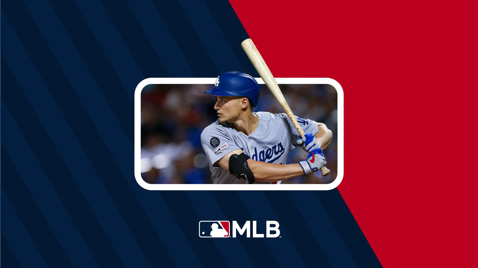
Building out from the Batterman.
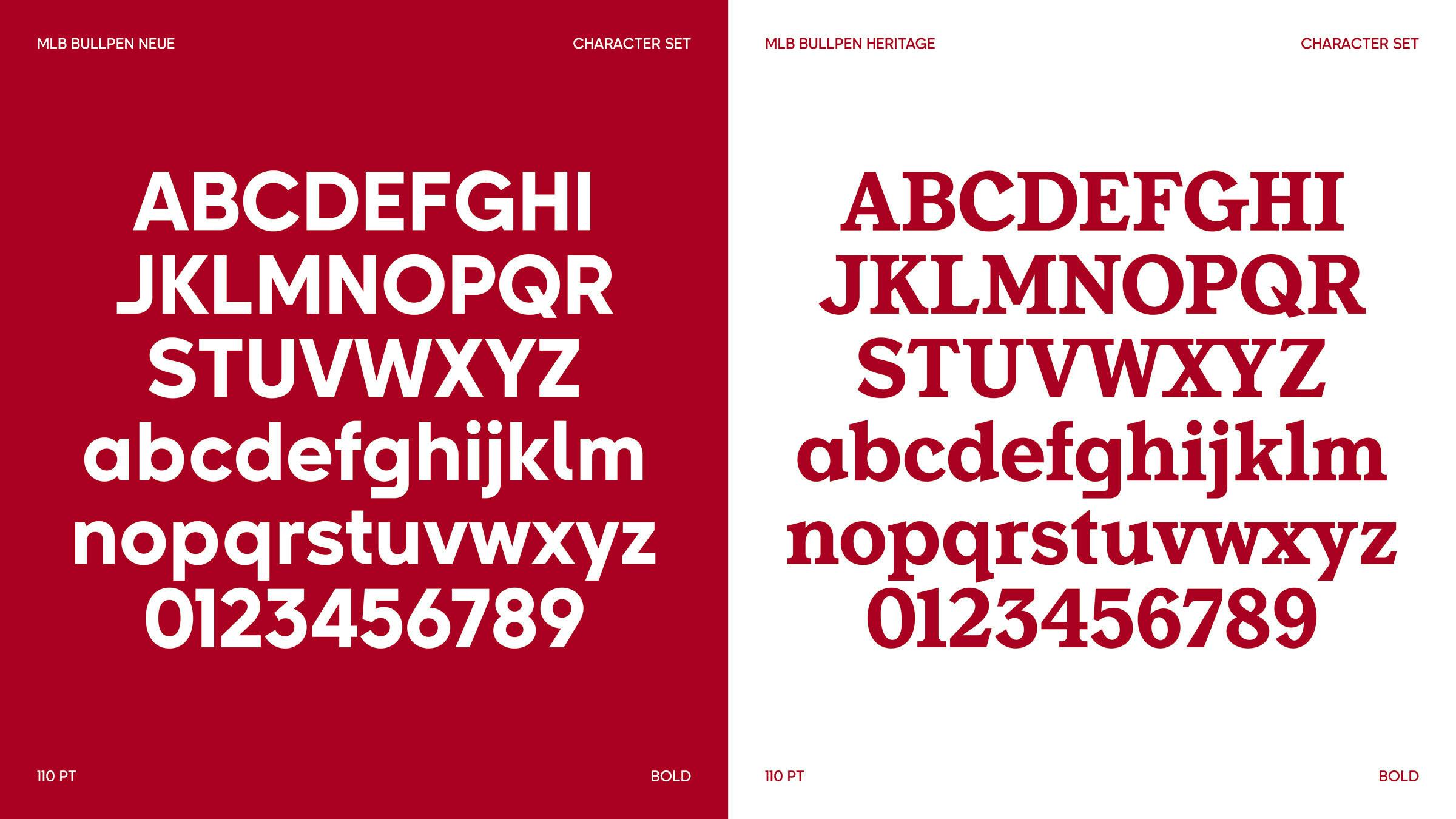
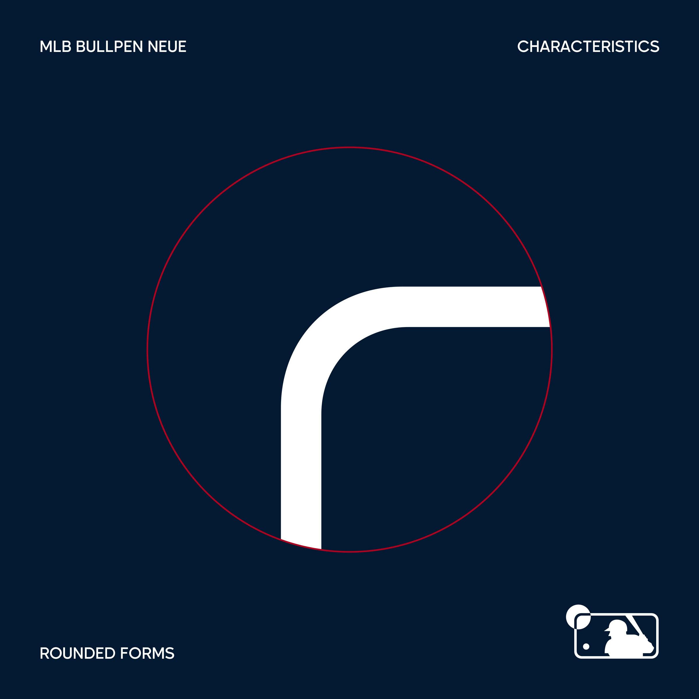
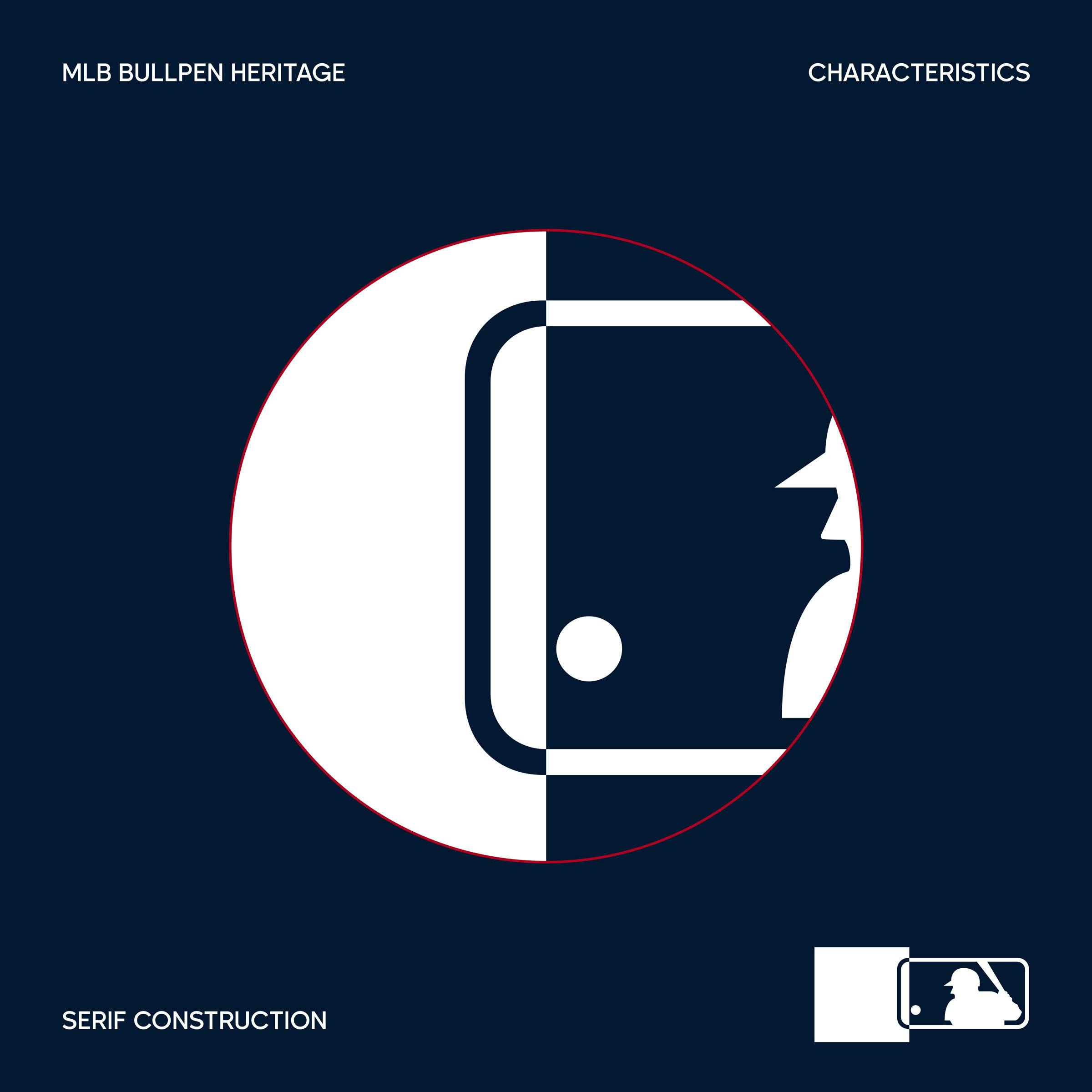
Going back to the roots of MLB, we looked to the Batterman for inspiration, finding it had everything we needed within it to create a coherent, global brand system. One designed to flex and stretch, whilst always feeling ‘MLB’. Everything we did, every decision we made, every angle and element we created was born from the Batterman. From the two bespoke typefaces, right through to the graphic language, a new world of colour and art direction principles.
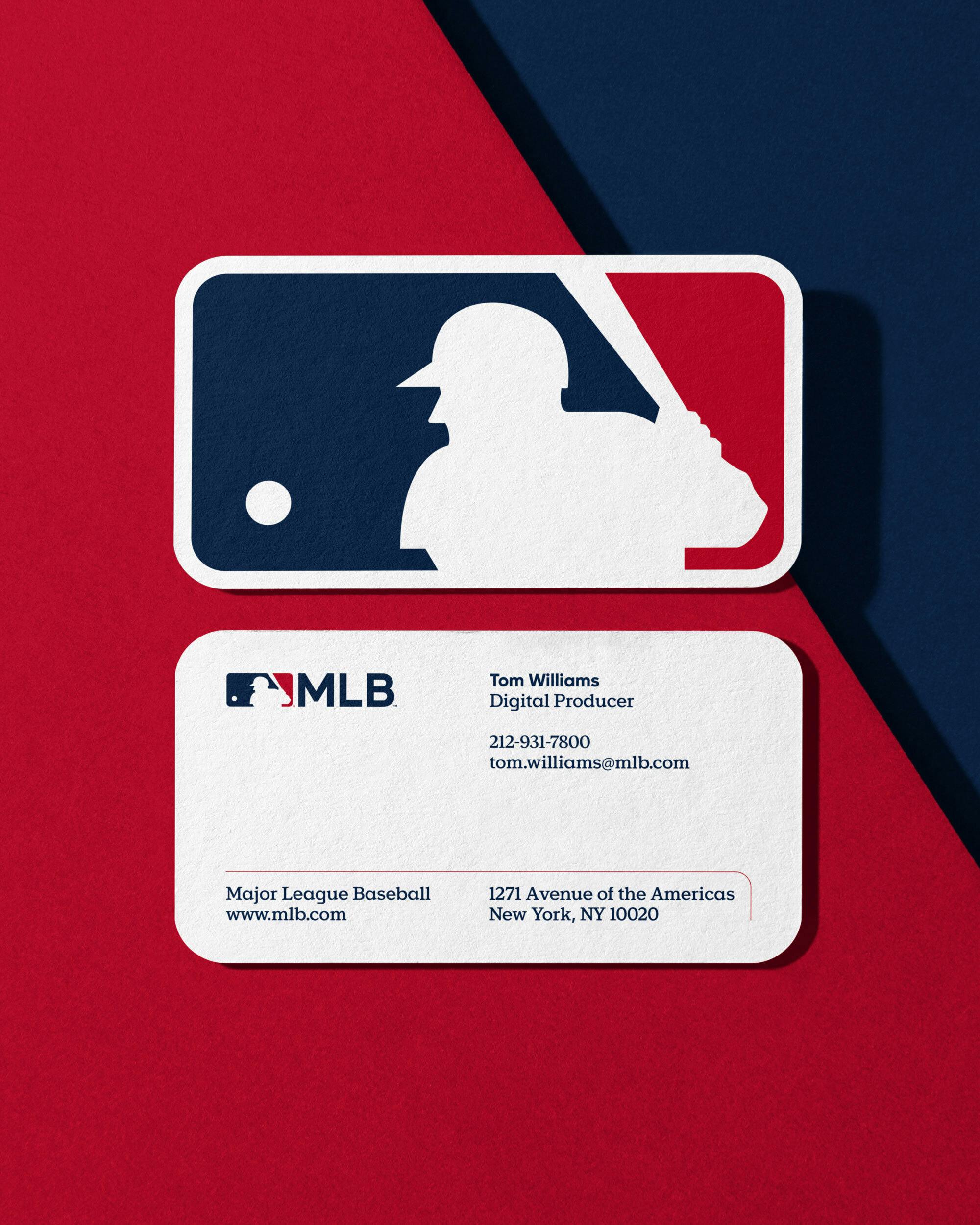
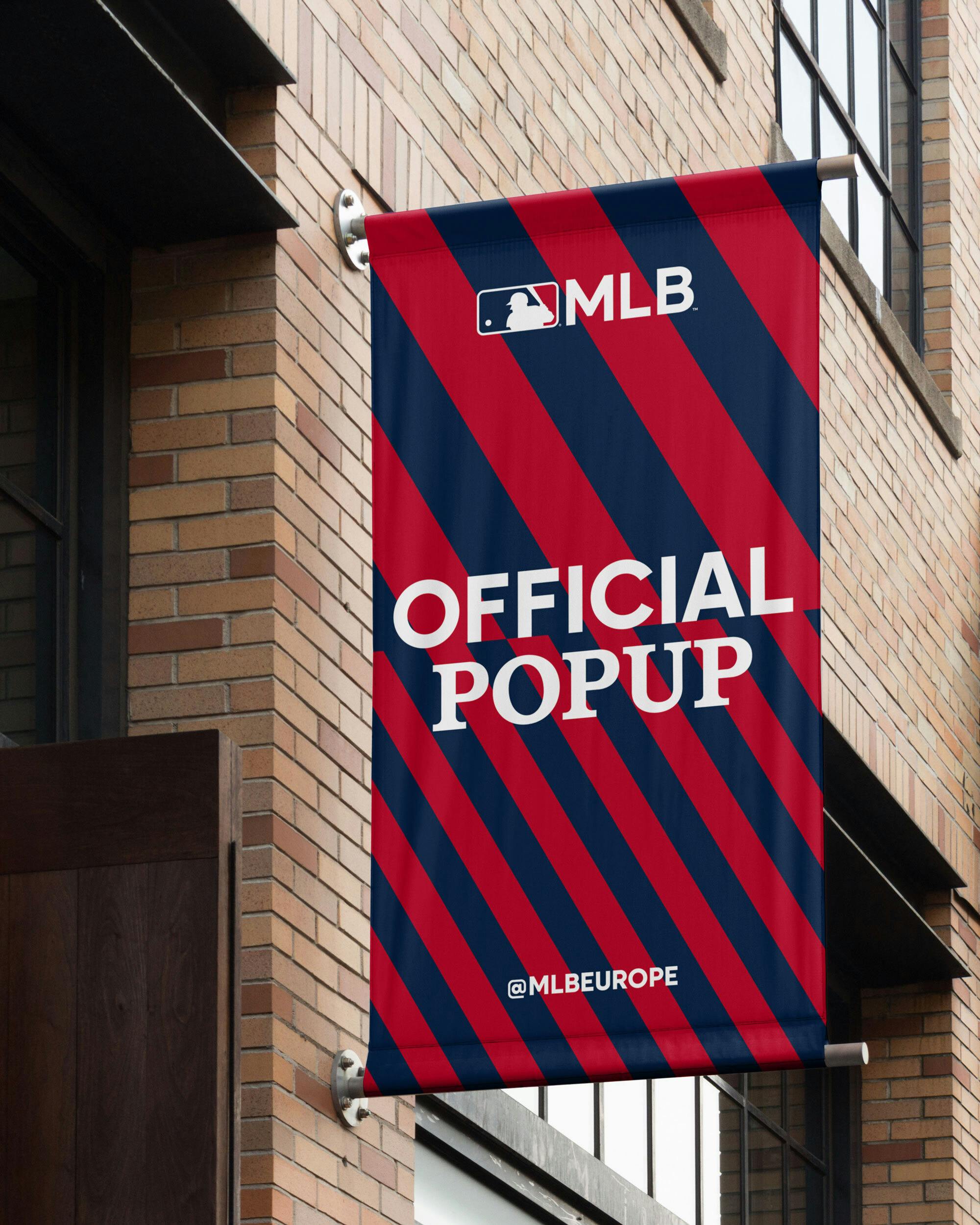


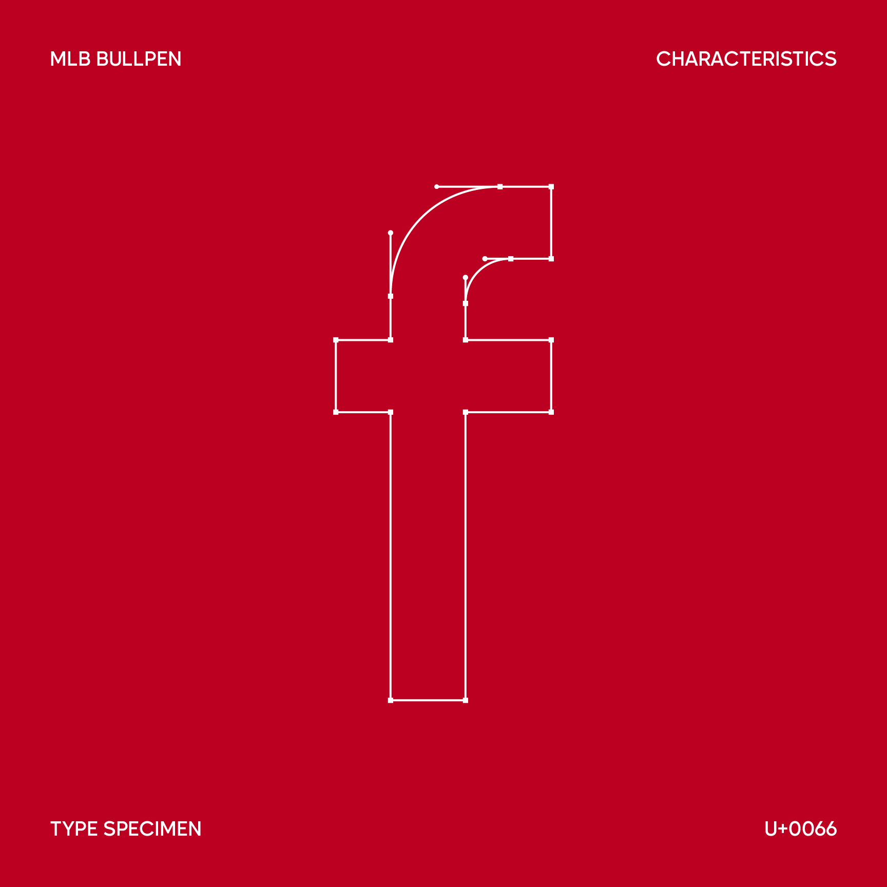
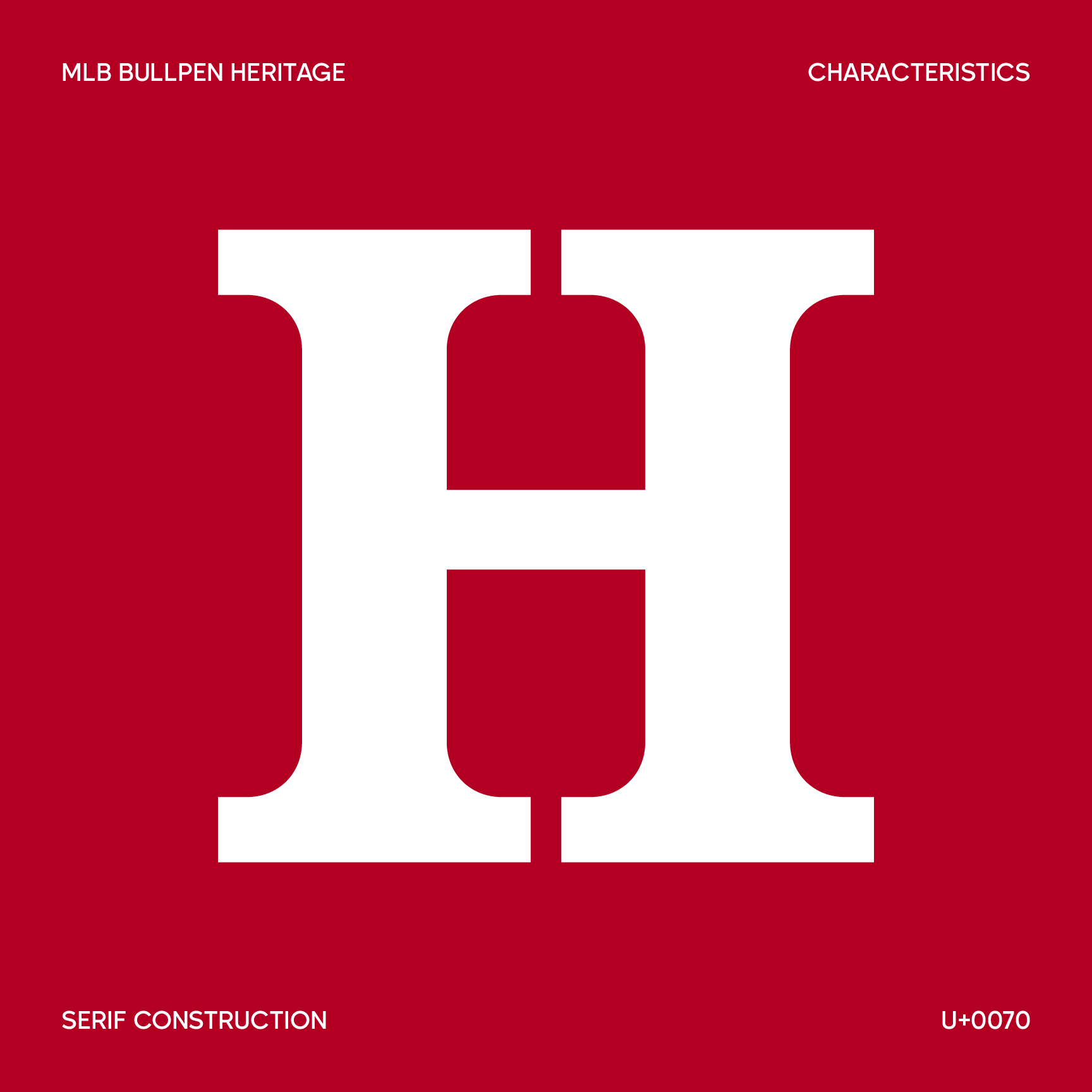
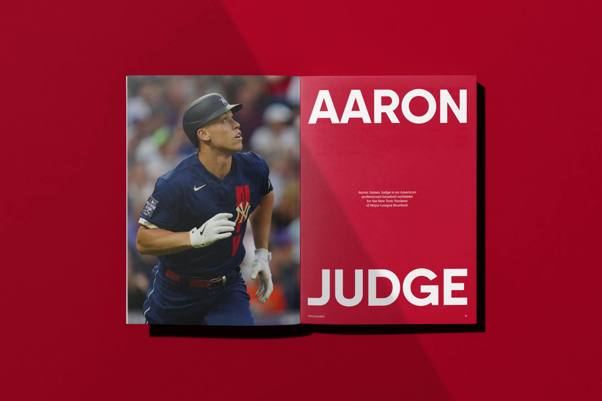
Together with the MLB creative team in New York, we created a complementary pair of bespoke typefaces, built from the geometry of the Batterman logo, inspired by the heritage and passion of baseball.
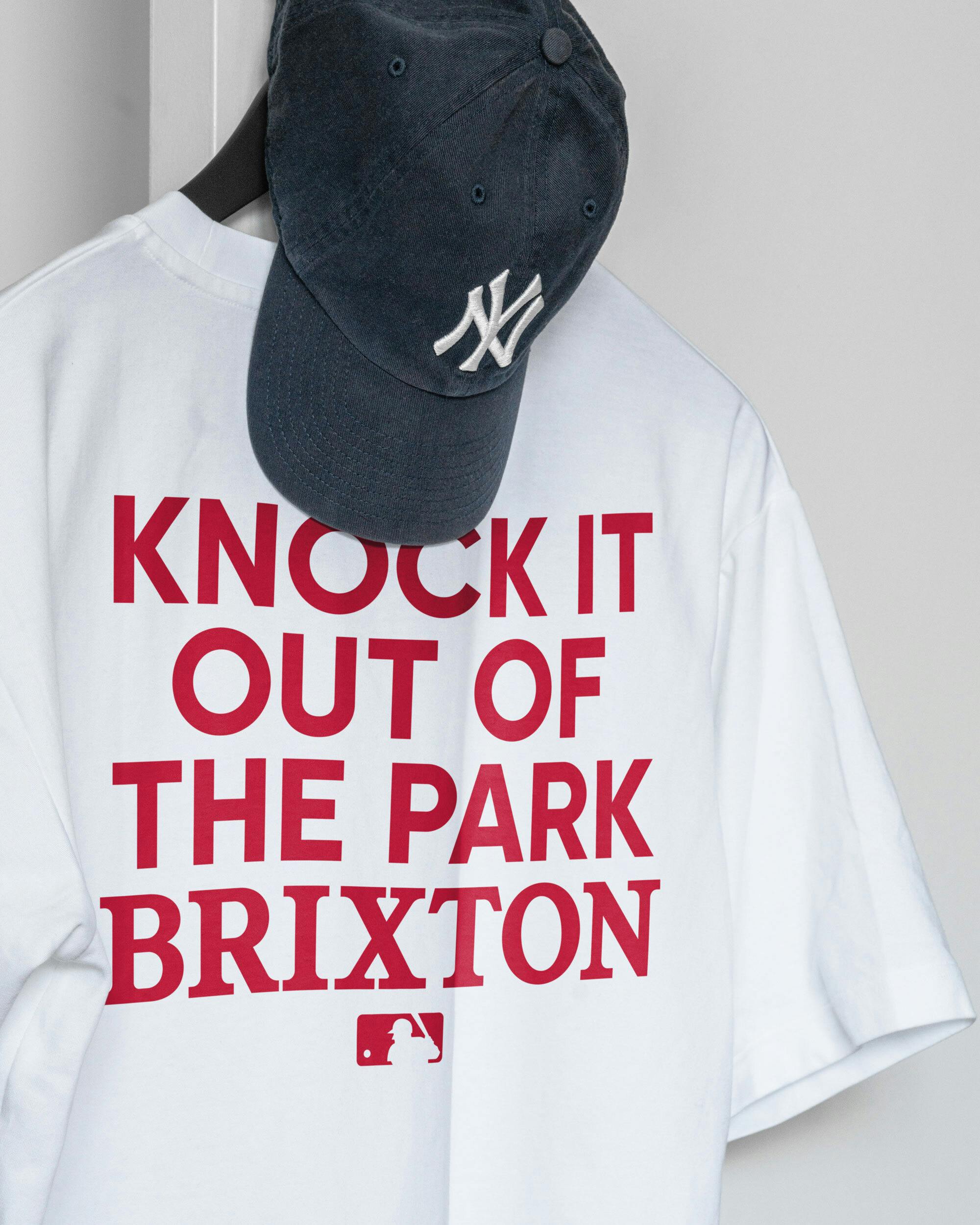
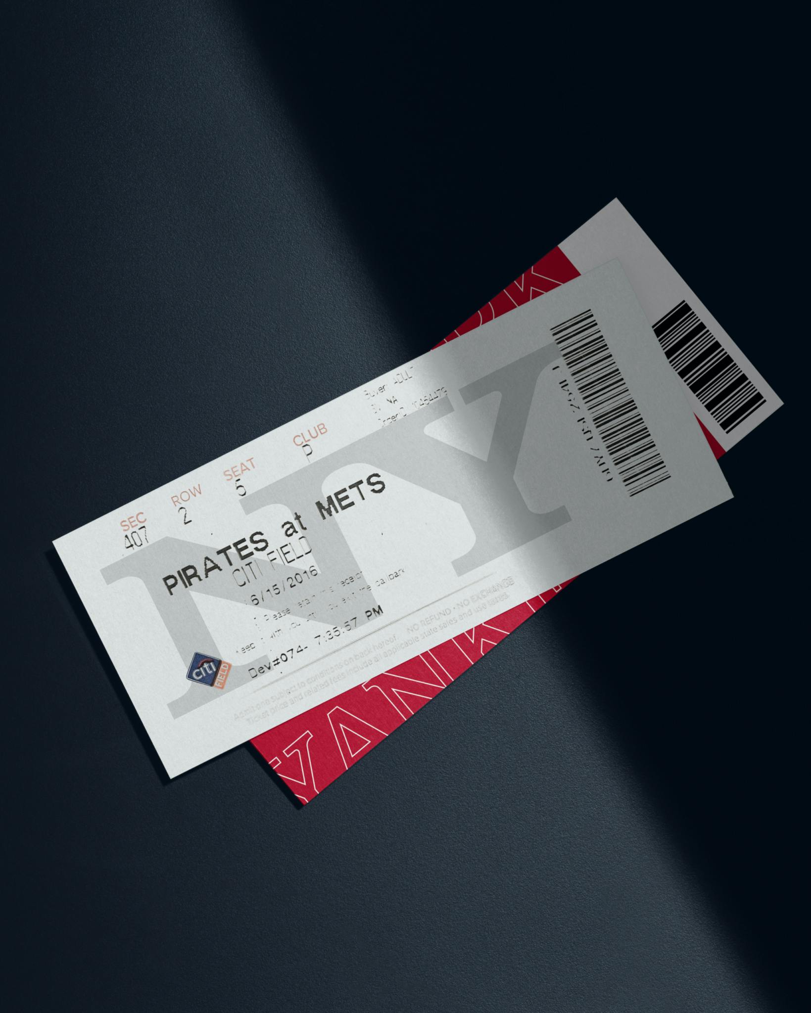
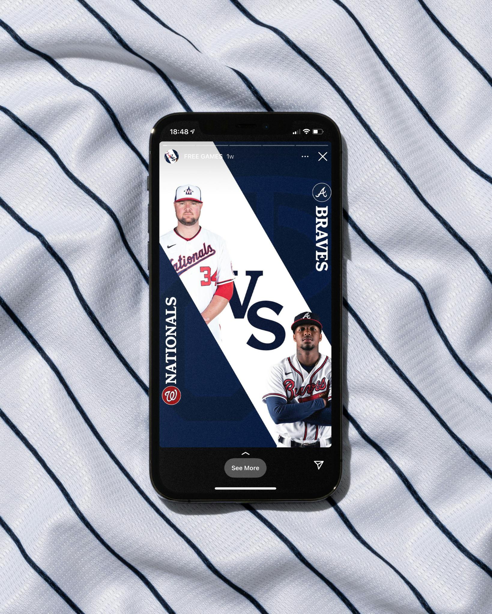
Made for a digital world
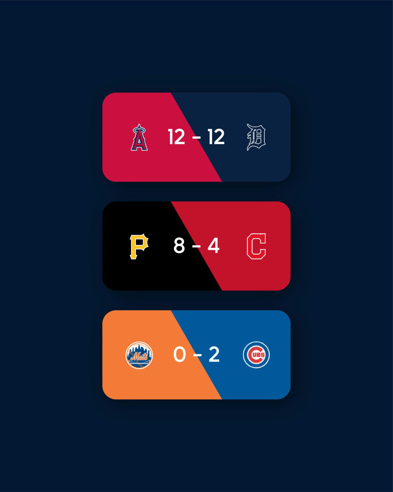
Breathing new life into the MLB brand through an extended global colour palette, directly inspired by its 30 clubs.
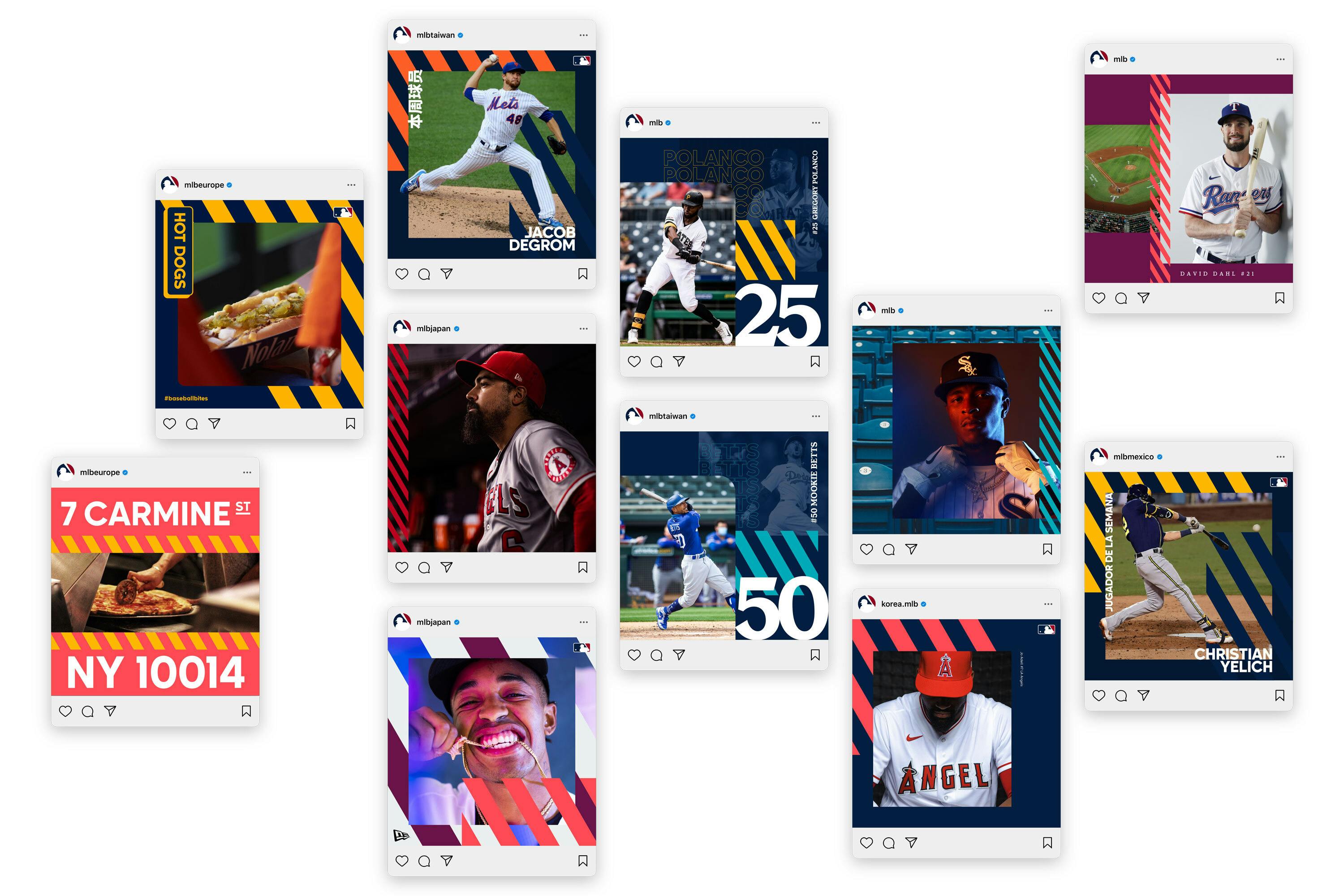
Out. Of. The. Ballpark.
Introducing a new standard of MLB experience. Made for every fan, everywhere. From hardcore fanatics, to first timers, stat geeks, foodies and festival goers. The new identity respects its rich history, whilst moves one of the world’s most loved brands forward.
Check out...

